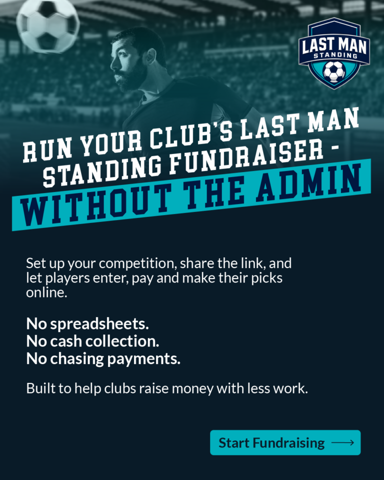
Consolidated social media identity for startup Last Man Standing app.
Last Man Standing is a web-based startup platform for running club fundraising competitions online. The only existing brand asset was a logo, so before producing any content I established the system the assets would share: the logo’s deep navy as the base colour, a single teal as the accent, a condensed display face for headlines, and a clean sans for body copy. Fixing these first meant the deck, the campaign messaging and the World Cup series could be produced quickly and still read as one identity rather than a set of unrelated posts.
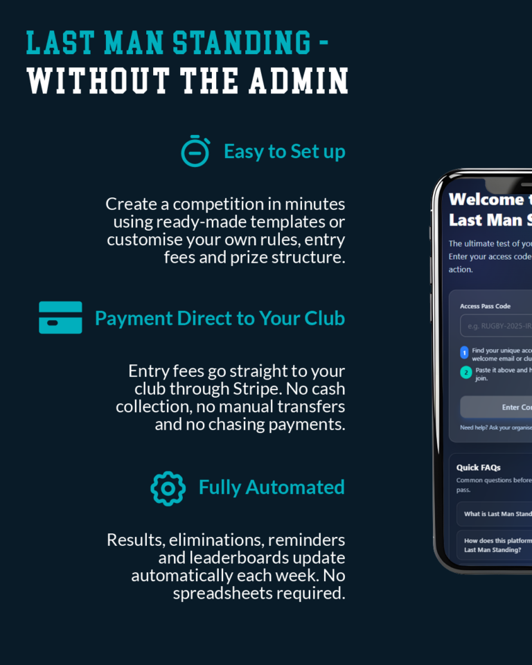
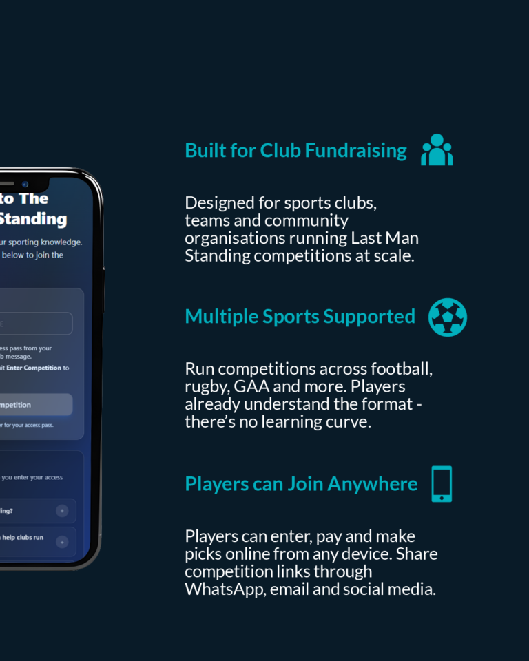
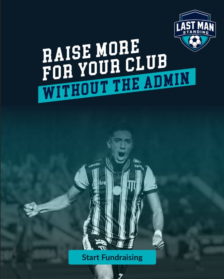
Explainer Carousel
A four-slide paid social carousel explaining the platform’s fundraising model, built on real product screenshots and other commercially licensable imagery.
The imagery here was a commercial decision before an aesthetic one. The carousel was made for paid distribution on Meta, where every asset has to be cleanly owned or licensed. Creative Commons photographs and real product screenshots removed that risk, and at the same time gave the credibility a sign-up-and-pay product needs.
World Cup content series
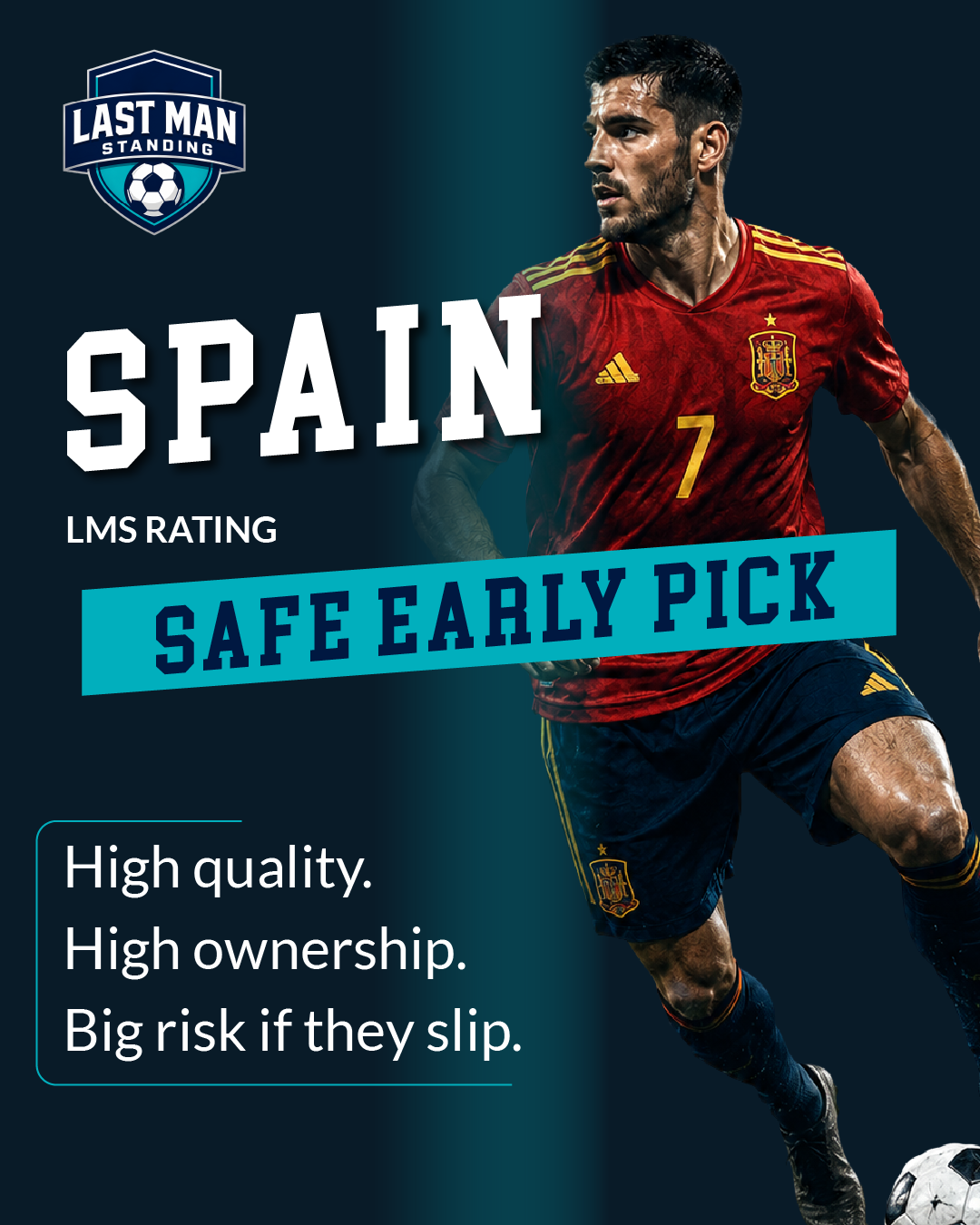
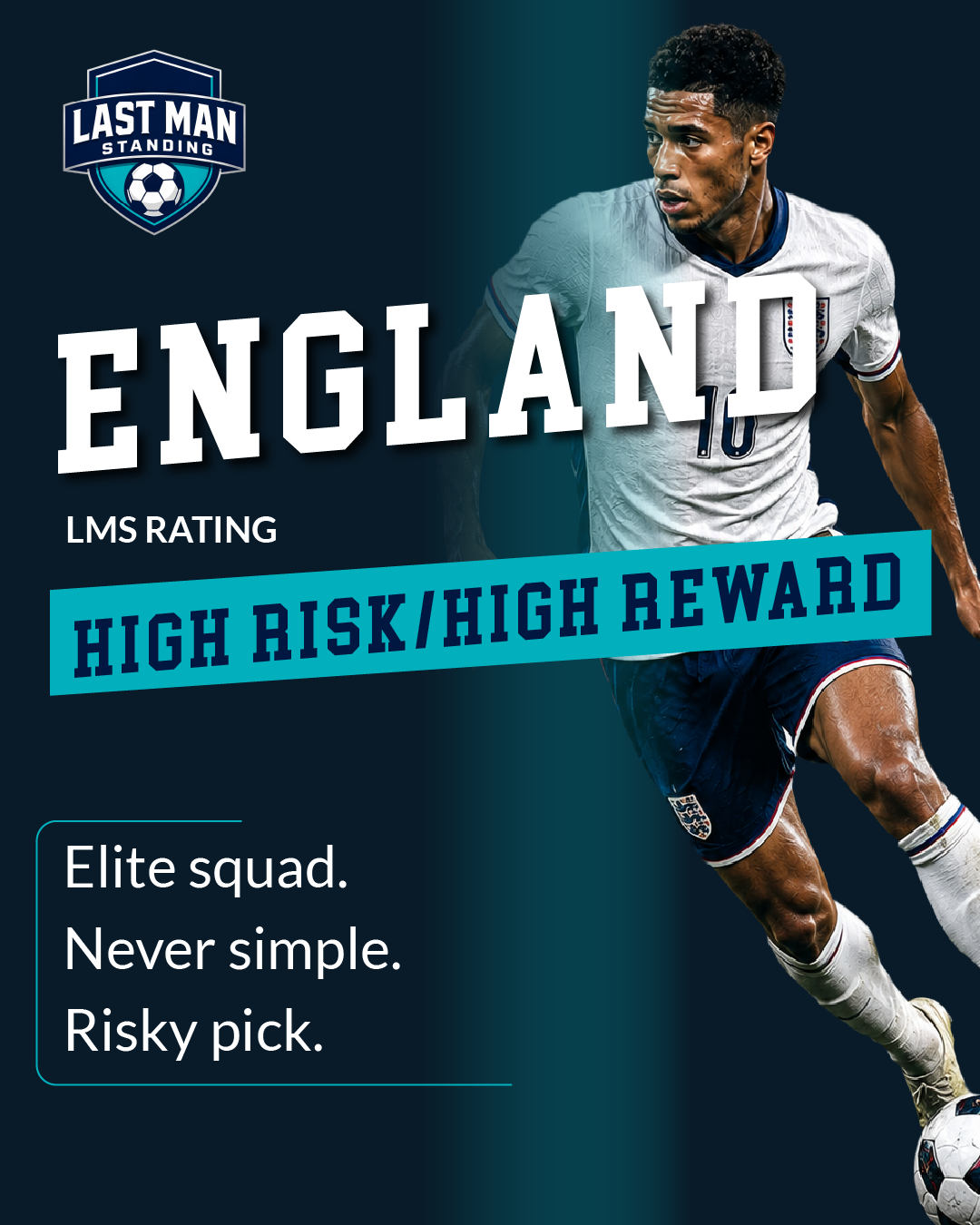
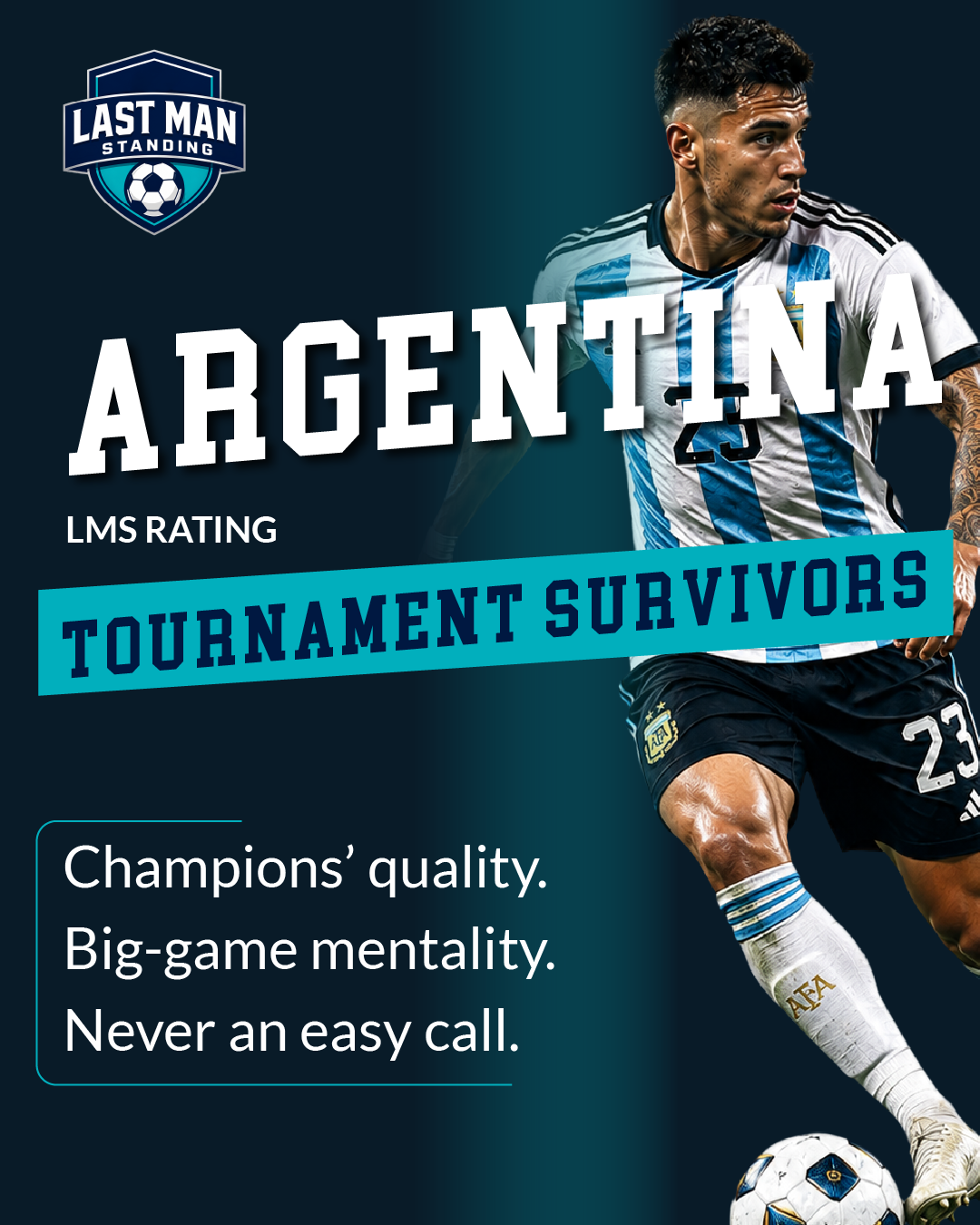
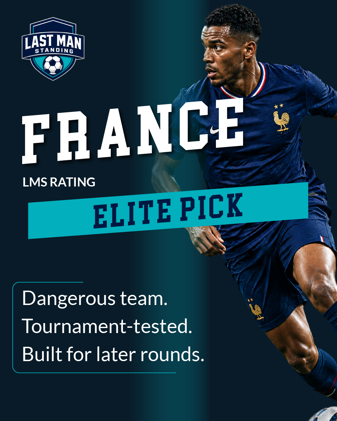
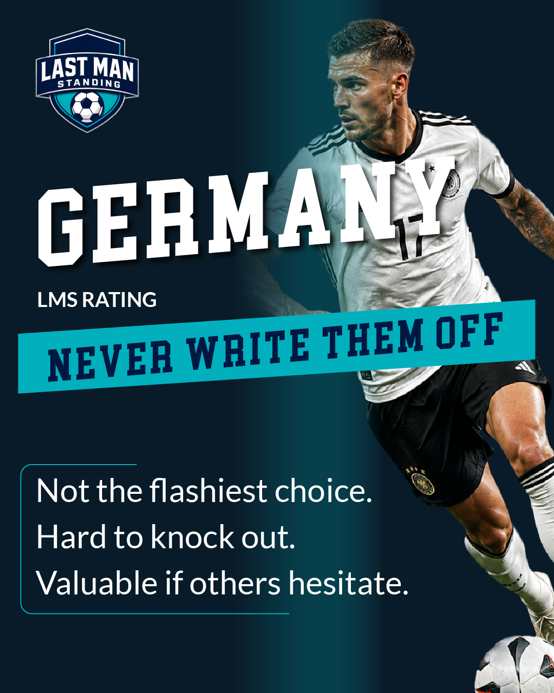
The World Cup assets used a repeatable format: country, player figure, headline, and an LMS tournament rating, allowing timely content to be produced consistently across the tournament. The ratings were written to reflect the product’s own mechanics: risk, elimination, and competition, keeping the creative tied directly to what the platform does rather than riding the football theme generically. AI-generated football figures were used throughout to create dynamic imagery appropriate for the content without relying on licensed photography or player image rights.